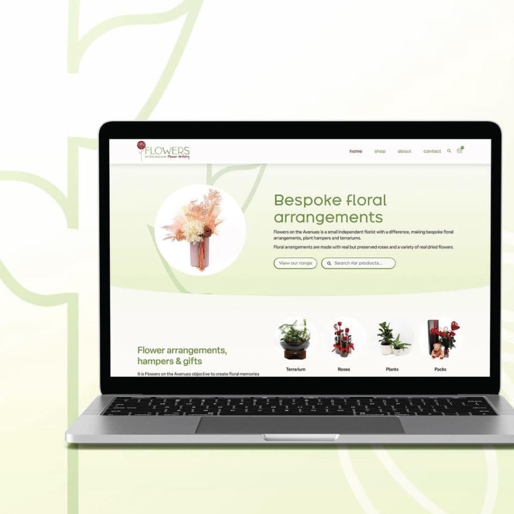
Flowers on the Avenues is a boutique flower artistry business specialising in elegant, handcrafted arrangements with a focus on dried and preserved blooms. The goal of this branding and website design project was to capture the natural beauty and timeless quality of their floral work in a modern, distinctive brand identity.
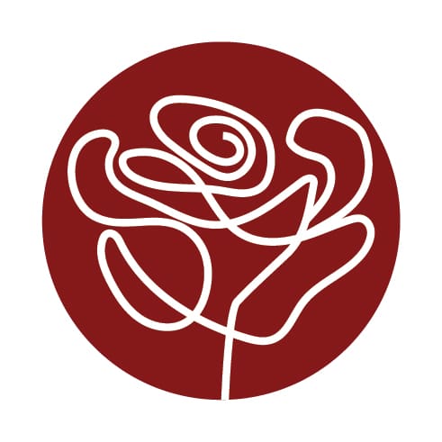
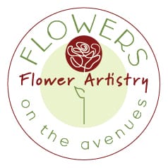
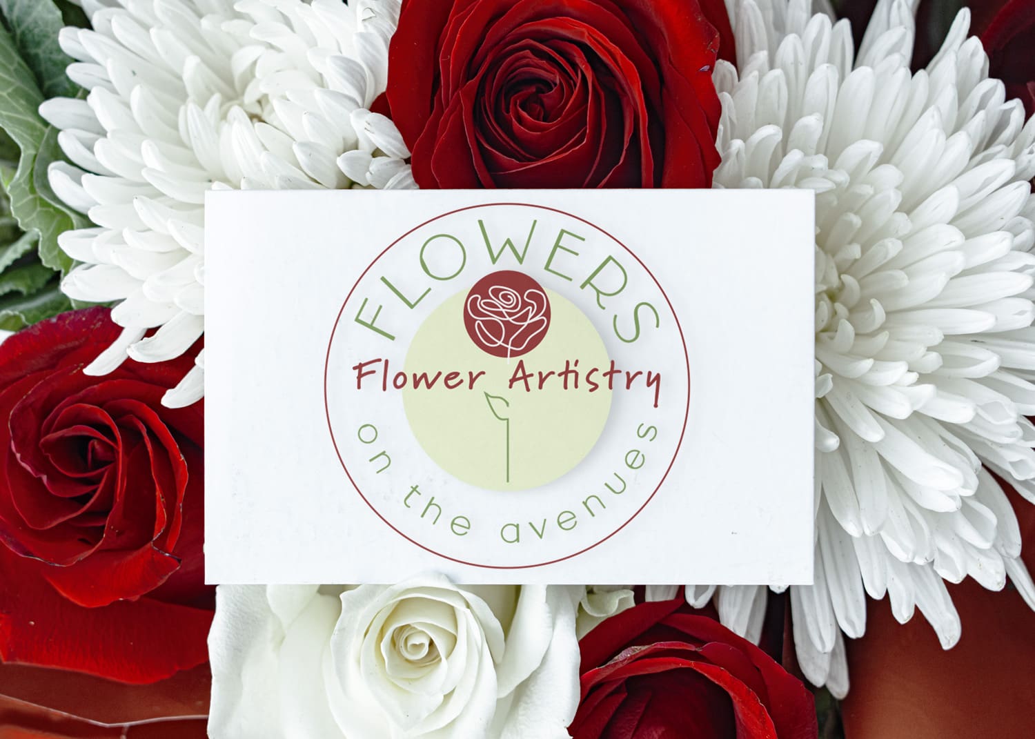
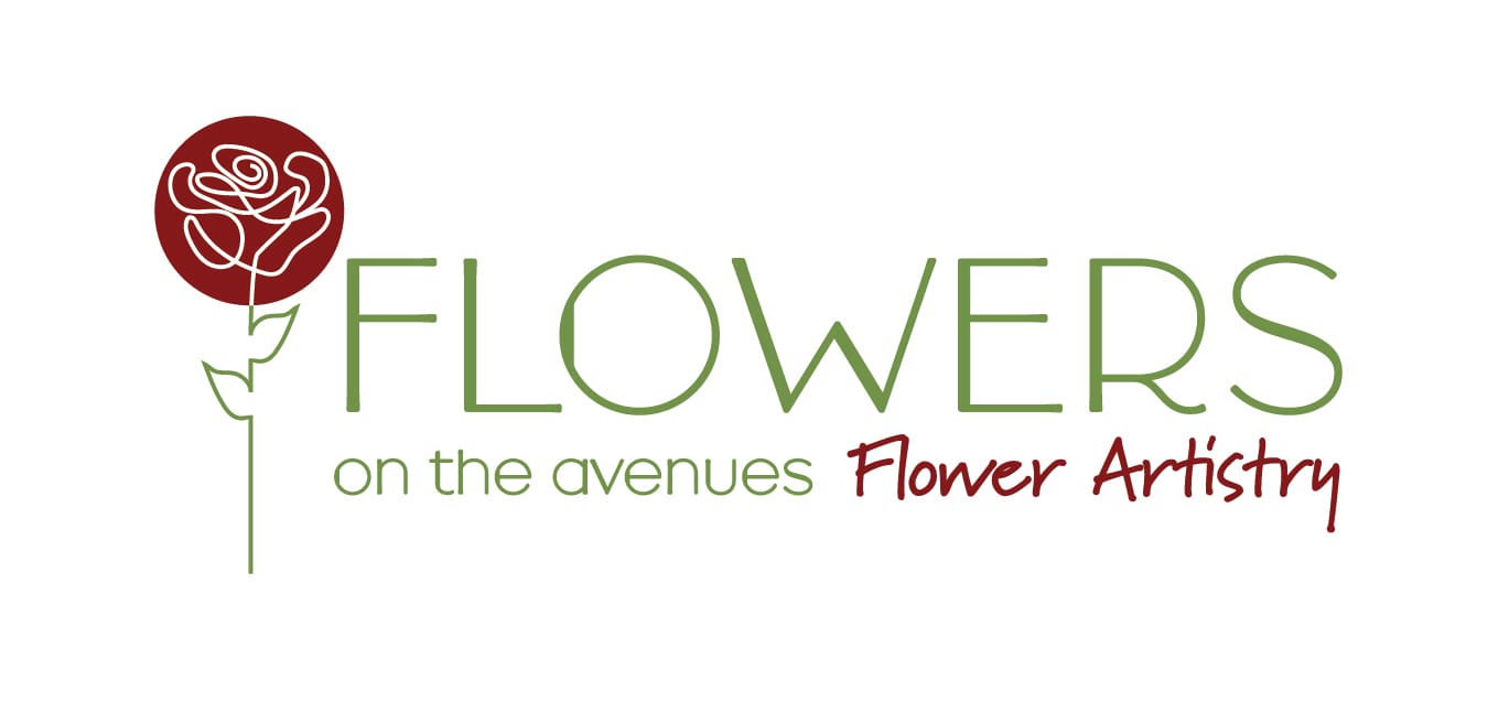
The logo combines organic flow with contemporary simplicity — a hand-drawn rose emblem that conveys artistry and care, framed within a circular form symbolising wholeness and nature’s cycle. This design perfectly reflects the lasting beauty and sustainable nature of dried flowers. The typography blends a refined sans-serif with an expressive handwritten script, balancing professionalism with creativity and a personal, artisanal touch.
A natural colour palette of soft greens, rich burgundy, and warm cream tones evokes calm sophistication and echoes the earthy hues found in dried floral arrangements. These colours create harmony between the brand’s natural inspiration and its refined presentation, ensuring versatility across print and digital applications.
The website design extends this aesthetic through a clean, elegant layout with generous white space and soft botanical tones, allowing the photography of intricate arrangements to take centre stage. The overall look and feel is warm, artisanal, and inviting — a timeless identity that communicates both creativity and craftsmanship, positioning Flowers on the Avenues as a modern yet classic floral brand.